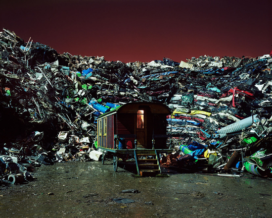
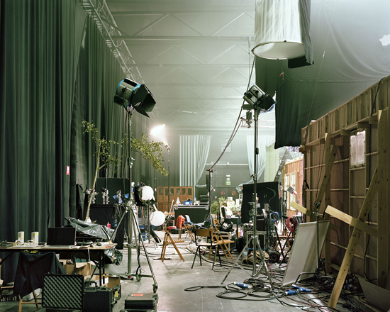
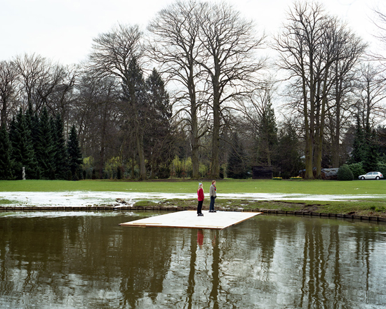
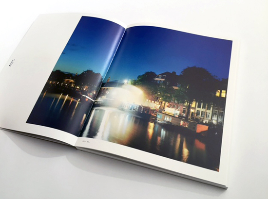
“In the period from 2008 to 2013 I visited various productions of Dutch spoken films in the Netherlands and Belgium. I photographed the film sets perched as fictional islands in the actual landscape with an large format camera. The Dutch film industry occupies a small place in the major international film world. Yet with limited resources they are able to realize an international professional product. My project explores the effect of imagination through the medium of film and how it comes about. As a viewer you are able to step outside the boundaries of the film and its created reality as I present the film set and the surrounding landscape as a whole. This works sobering, because the set is so little enchanting and small, but when you think of the professional outcome of the Dutch film the images also create surprise and amazement.”
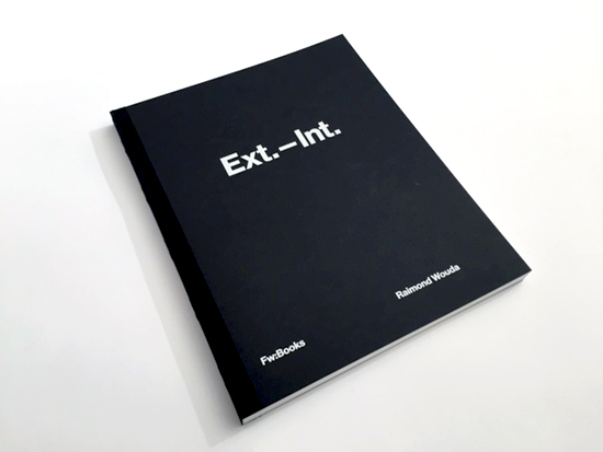
Ext-Int Statement – Raimond Wouda
Ext-Int is selected for the Best Dutch Book Designs of 2015
“Cinema is a matter of what’s in the frame and what’s out.”
The book opens by this punctual quotation of Martin Scorsese who immediately show how much the preliminary statements of Raimond Wouda’s photograph have deep roots into an analytic and documentary approach of reality. In this case the reality (built? mock? Is the same of the cinematographic sets realized between the Netherlands and Belgium. A long term work lasted for years where only 69 images compared to the 1000 implemented, found room in the recent publication printed by Fw: Books. The descriptive content and the structure of photographs are very rich and extremely controlled in the appearance and style. In spite of this, all that we find inside the image seems to suggest what is excluded, in a mental project more complex and allusive. An invitation to the action of looking where takes shape all that in the cinematographic imaginary is named ‘the mistery of images’: the connection between reality and possible, between visible and invisible. We ask ourselves again and again about the absence and the presence of the elements which make up the scene. This dialectic relation in which whom looks over is inclined to complete mentally what the author indicated him through the images, is made explicit in the final part of the book where it is possible to see the scenes by a mobile, through a free application (Layar / Android o Iphone). Graphics of the dutchman Robin Uleman, edited and designed as if it were a scenario of a film, summarizes and makes simple very well the interdisciplinary and the relation between different medium. As if, outside of the “ box” could open new universes and a new series of possibilities, hypothesis, stories. At this point what recalls to my mind is this sentence of Jean Luc Godard: "What i like are two images at the same time, so that after there is a third of it, which is not an image but better what we get from the two other".
Gianpaolo Arena
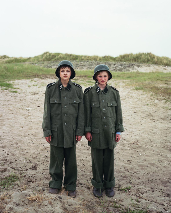
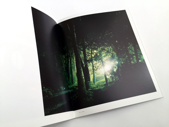
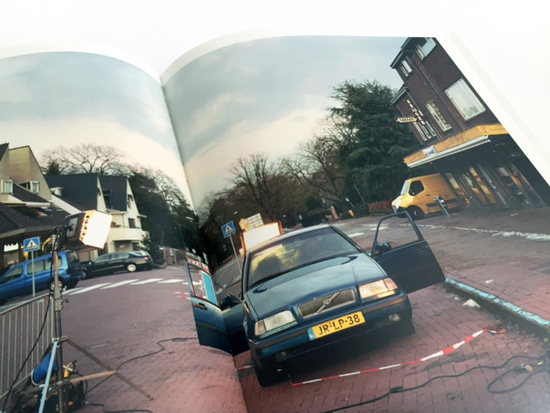
A Christmas Story, Lint, Belgium
Intervista
Gianpaolo Arena: Could you tell us something more about how your project ‘Ext.-Int.’ started?
Raimond Wouda: The idea for project started a long time ago, more than fifteen years ago to be precisely, when I visited a film set to make film-stills because the still photographer was ill. It was the first time I visited a set and I arrived with big expectations. The reality proved otherwise and I had to wait for a long time before my services were needed. To pass the time I wandered around and then I noticed the influence of the artificial light on the surroundings of the film set and the shift in the significance on that surrounded area. At that moment the idea of a series where reality and fiction meet was born. It only took some time when I actually started, but that seems to be normal with me. An idea has to remain for me for a long time before I take it seriously.
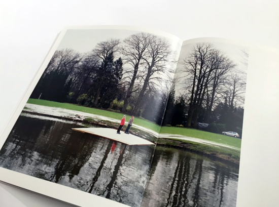
Her Majesty, Wijnegem BelgiumSonny Boy, Wijk aan Zee, the Netherlands
GA: How do you approach the landscape, the urban spaces and the architecture while working on your project?
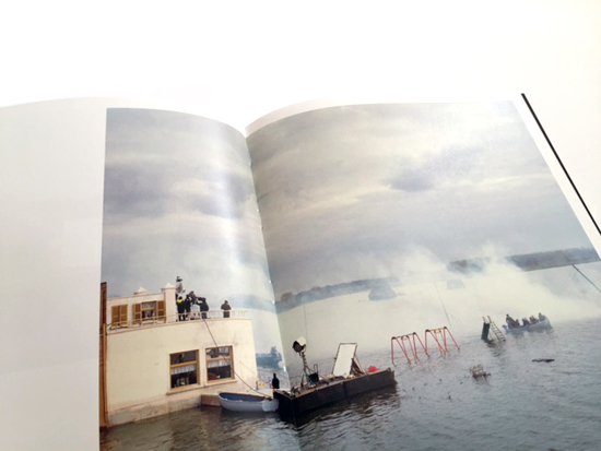
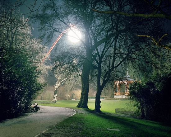
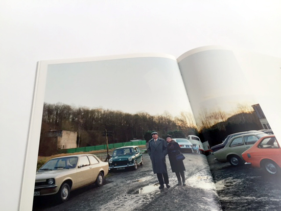
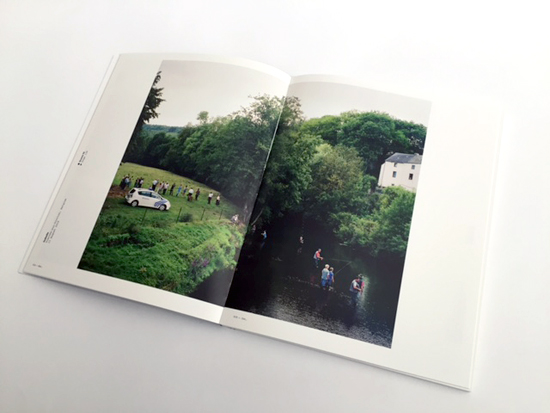
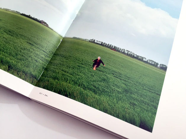
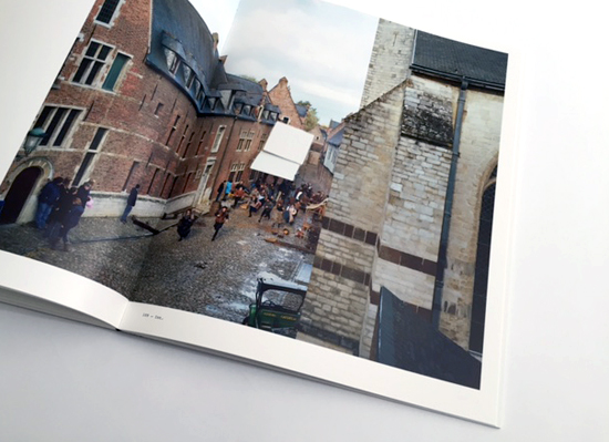
RW: My project is about the construction of Dutch spoken films, situated in the Dutch and Belgium landscape. The film set is always part of the landscape, the urban space or the architecture. It was my intention to show how the film set was relating to this specific environment. As the world of cinema mostly is intervening in the existing landscape, I was curious how this meeting manifests itself. While looking for my point of view I was mostly searching for a place in which we could see both the film set and the surroundings. In this way the viewer is given the opportunity to step outside the framework of the film and its created, sometimes spectacular reality, because I focused on both film set and surrounded landscape. This works sobering because it is so little enchanting and small scaled.
GA: How did your collaboration with Fw: Books and Robin Uleman start?
RW: I have met Robin at the opening of an exhibition of our mutual friend Henk Wildschut and we started to talk about our most recent projects. Robin became interested in my project about the film sets and mailed me some time later if he could see the project. As we both are quite obsessive in the things we do, a collaboration seemed interesting. I could imagine we could work together in a way so we could get to best out of each other. I know Hans Gremmen for some time now and I have a lot of admiration for his work and his publishing house. So for me it was evident that I hoped that I could publish the book at Fw: Books.
GA: Are you involved and interested in film industry? How much were movies a source of inspiration for you when you started to search for your photographic style? Who are the filmmakers that most excite you today?
RW: I am not involved in the film industry but I can say I have spent some time on film sets the last years. It’s an intriguing world but not my cup of tea. It’s a very complicated world to work in. I don’t have the patience to work in such a structure. I love movies but I don’t think they are an inspiration for my photographic style. I didn’t want to use my camera in a cinematic way. I think my way of photographing for this project is much more influenced by topographic photographers. What really struck me while doing research for this project were the pictures taken on the film sets of Fritz Lang. They are fabulous, breath taking and very inspiring. Perhaps my frustration is that I never have visited a film set on that scale. But perhaps that’s the charm of the Dutch film industry. It’s relatively small in scale compared with countries like the States. I like a lot of directors, so I could make a never ending list. But if I have to name a few; I am very interested in directors like Truffaut, Bunuel, Bertolucci, Visconti, Malle, Coppola, Scorsese, Jamusch. But I am interested as well in more contemporary directors like the Coen Brothers, Haneke, von Trier, Steve McQueen and I love the directors of most Pixar Movies.
I think it was somewhere in 2013, more than a year before we actually started working together, when Raimond and I first met at his studio and talked about making a book about his longterm project on film sets in The Netherlands and Belgium. When I asked him what the central idea of his project was Raimond told me that he wanted to deconstruct the constructed reality of film. In other words: showing how vulnerable, tinkered and sometimes straightforwardly clumsy these sets are. He pointed at a picture of a film crew busy somewhere along the Dutch shoreline: tiny figures on a vast beach under an even vaster sky filled with darkening clouds that would soon start to pour down. That made it perfectly clear.
During that conversation Raimond showed me lots and lots of material. The core existed of numerous film sets on various locations, outside and inside. Sometimes an actual scene was recorded the very moment the photograph was taken. His way of framing illustrated how these sets were embedded in reality: sometimes the fringes between fact and fiction were really clear — I saw pieces of reality that obviously wouldn’t appear on screen — in other pictures those borders were less easy to discern.
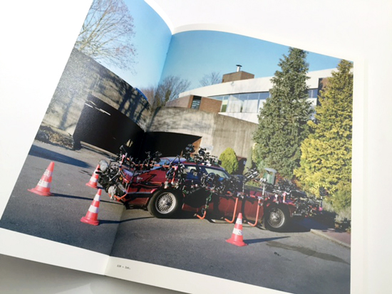
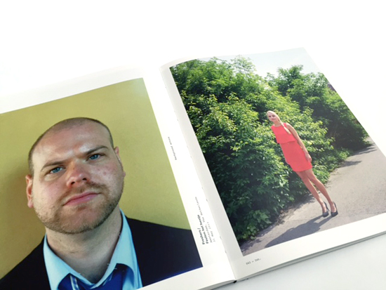
Apart from that we also looked at collateral material: stuff he shot to create more context. There were portraits of so-called extra’s or supernumeraries, support actors without text, taken on the set while waiting for the next scene. And from the archives of casting agencies he collected vast rows of informal candid shots of the same people, wondering if they should be given a place in this book or not. The same question applied to a series of pictures showing storage rooms and sheds filled with costumes, furniture, vintage cars and trucks to be rented out as props. And he was also trying to lay his hand on some screenplay fragments of the actual scenes to be depicted in the book, wondering if they would add any value. It was all very interesting, but we couldn’t articulate a clear editorial outline yet. It had to sink in.
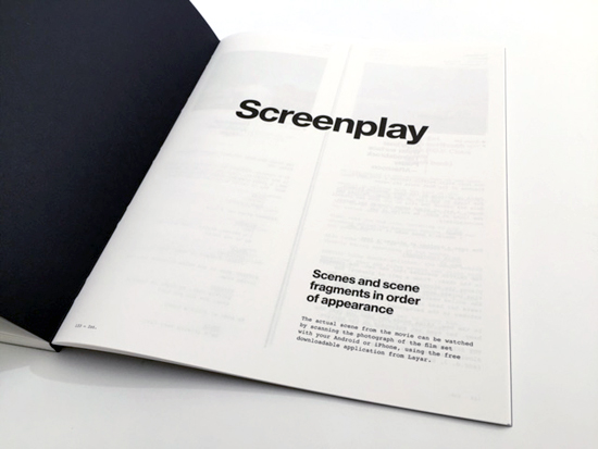
Some months later we met again and our ideas had cristallised more. In the meantime Raimond had been collecting the actual film fragments that were shot when he was on the set with his camera and was waiting for permission to use them for the book. Instead of inserting a DVD at the back he wanted to apply Layar, a digital technique that makes it possible to scan a printed picture with your smartphone to directly connect with extra online content. In that way people could experience the difference between the reality of the photograph and the reality of the movie.
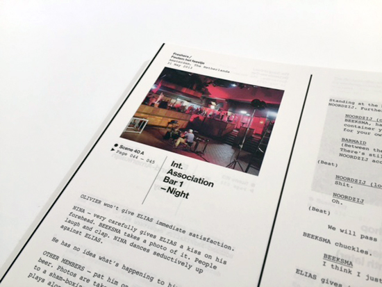
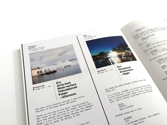
We further honed in on the interesting relationship between the paper reality of the screenplay, the staged reality of the film set and the invented reality of the film as such. We decided that we would somehow bring those three elements together in the book.
The pictures from the casting agencies were skipped, it would become too much and too confusing. But we were convinced that the portraits and the screenplay fragments would paint an interesting backdrop to the set pictures. Apart from that I had a strong feeling those extra elements were essential to break the pace and rhythm of the book. Raimond is a very precise photographer, he shoots on a large format to evoke maximum detail and his compositions are usually very deliberate and as such have a tendency to stand alone. The easy way would have been to concentrate on those landscapes and leave the rest, make a nice edit and fit them in a tastefully designed large format and that would be the end of it. The result would be a collection of beautiful and interesting pictures, rather than a narrative about making movies. That would miss the point.
In the beginning of 2015 funding was almost complete so I could finally start working on the book. I first concentrated on the edit, without even bothering about the design. As said, the monumental approach and the specific atmosphere of all those different sets tend to isolate pictures from each other, so I was eager to tackle that problem right away and see if there was a meaningful undercurrent that would emerge.
Every book project is different: sometimes I have an immediate hunch for the atmosphere and the story the design should bring across, sometimes I have to start selecting and playing with the material to come to an understanding. This project took me to the floor of my studio to endlessly arrange and rearrange thumbnails, until I had two distinct edits I could mount on several large pieces of paper. One of the edits also included pictures of the various storage houses for props and cars. When Raimond and I discussed these edits we concluded that those props and cars refused to sit naturally with the rest of the pictures and we decided to kick them out. Apart from that he had various remarks that helped me to rearrange and refine those edits.
Two weeks later we discussed two new versions, again mounted on paper, but I had also put them in a number of crude digital lay outs to be able to judge the pace and rhythm better. In one version I had created an extra layer to be switched on and off. This layer contained an extra inserted page of a different size holding a screenplay fragment. My idea was to have them inserted on thin paper in between a fixed number of pages. But the result didn’t really convince us. Flipping through the pages it felt a bit coincidental and cluttered; it interrupted the flow instead of pacing it. However, this didn’t mean we wanted to dump the screenplays all together, it just wasn’t the right way to fit them in. If they should remain part of the book — I convinced Raimond — we had to include all of them, not just a few to add a certain movie flavour.
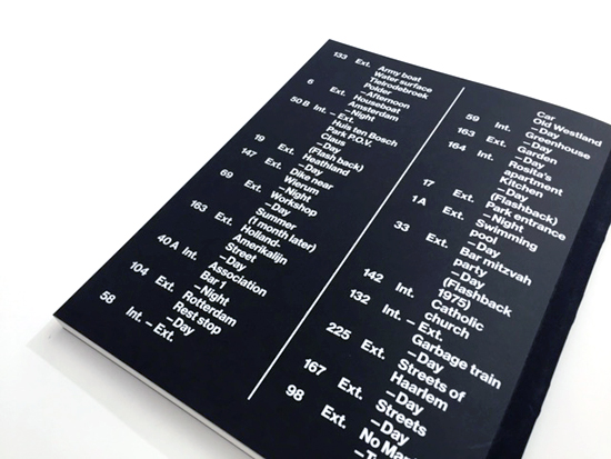
This meant more work for Raimond, but a substantial and consequently applied amount of screenplay fragments would justify a separate section at the end of the book. This would clear the stage for photography and at the same time it would create more attention for the various scripts. I liked the idea of designing a navigation system that would establish a clear relationship between the depicted scene and the screenplay in the back. Furthermore making it a proper section in itself, the screenplays provided the solution for the overall typographic style in which I decided to make a reference to the deadpan type setting defaults that are usually applied in these documents.
Now that the structure and the design became more articulate I could start concentrating on the book’s physical properties. First of all it had to fall open perfectly to give way to the photographs that asked for a certain size to be able to relish them. Secondly I wanted the screenplay part to have another tactical sensation; In contrast to the high quality matt coated paper for the photographs I wanted thin uncoated paper in the very same shade of white or in a distinctive colour. And thirdly I wanted to make the separation between the two parts very physical, not unlike the fake walls created on a stage or a film set.
Disovering the right cover
A couple of weeks later we sat together with Hans Gremmen, the publisher, who is a prolific designer of photo books himself. Overall he was pleased with the design and the edit, however he had some trouble with the cover which held a picture with the title in large type set off against it. He thought this didn’t reflect the off beat mentality of his publishing house. As a matter of fact it didn’t really match his own taste in covers at all. He preferred either image or type, not a combination of the two. In this case he’d rather saw a plain typographical approach.
At first I disagreed, since I was being briefed by Raimond to design a book that was culturally interesting, but not encoded in such a way that it would exclude a larger, less informed audience. Therefore I was convinced it should start communicating on the cover. And a well chosen image combined with an expressive title would serve this purpose better than just a title, which, to make matters even more complicated, wasn’t decided upon as well.
But during that meeting we also discussed several binding options I had sketched and worked out and we all agreed the book in your hands shouldn’t feel like an official book, but should make an informal presence instead, almost as if you had picked up a real screenplay. The more I thought about it the more logical and appealing it became to decide for a simple cardboard cover with just a piece of linen to protect the spine. It actually matched very well with the understated design of the interior.
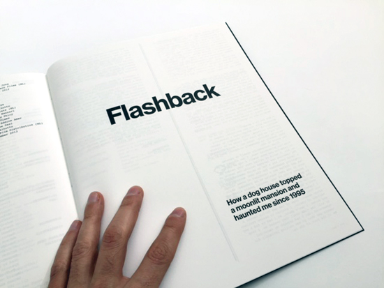
Some weeks later Raimond came with the title Ext.—Int., which refers to the shorthand used in screenplays. Ext. stands for exterior and Int. stands for interior, usually followed by a limited number of descriptive words that set the scene in terms of location, atmosphere and time of the day. For people in the film industry those two abbreviations are crystal clear, for people outside the industry they’re perhaps less understandable. To set the general public on the right track, or to at least raise their interest, I listed those typical scene setting words from each screenplay featured in the book. That list, mysterious in its briefness, is at the back of the cover. Hopefully it creates the right kind of suspense.
The text with Robin Uleman is curated by Marina Caneve.
Raimond Wouda (1964). He got his education at the Royal Academy of Arts in The Hague between 1987 and 1992. He has worked on several projects mainly longterm. In his photos he reveals a passionate involvement with people in the Netherlands. Besides ‘School’, which focuses on the life of Dutch adolescents, his other series include ‘Tuindorp Oostzaan’, about the last Dutch working class neighbourhood in Amsterdam and ‘Audience’ which reveals the audience as a social community. Recently Wouda is continuing his series about secondary schools in other European countries. In 2013 he will finish his series about the Dutch Filmindustry. With an unerring instinct and a sharp eye Wouda captures the rich tapestry of everyday life in wonderfully balanced and layered photos.