“Billboards and no Further ”
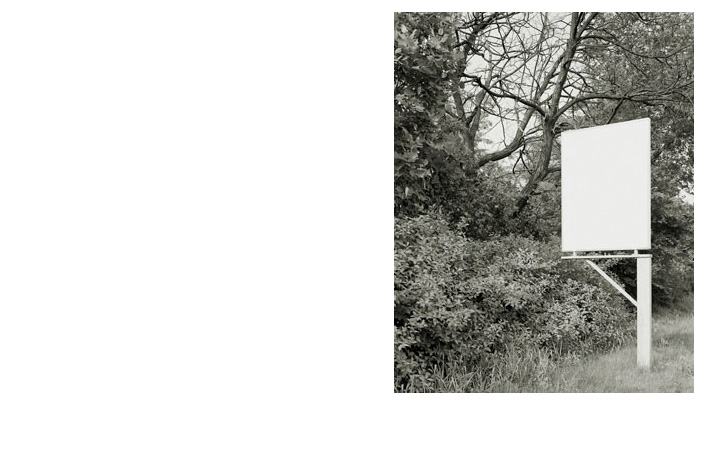
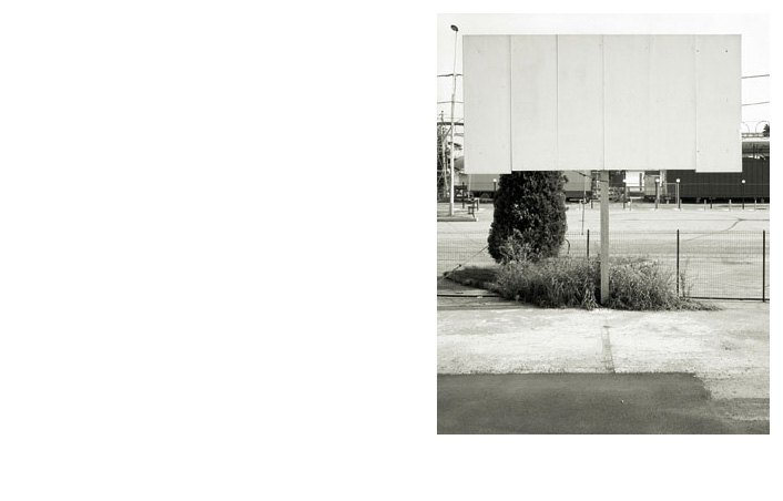
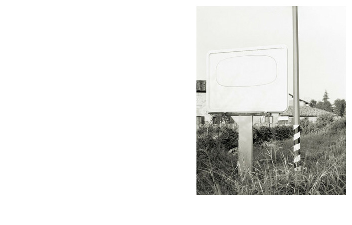
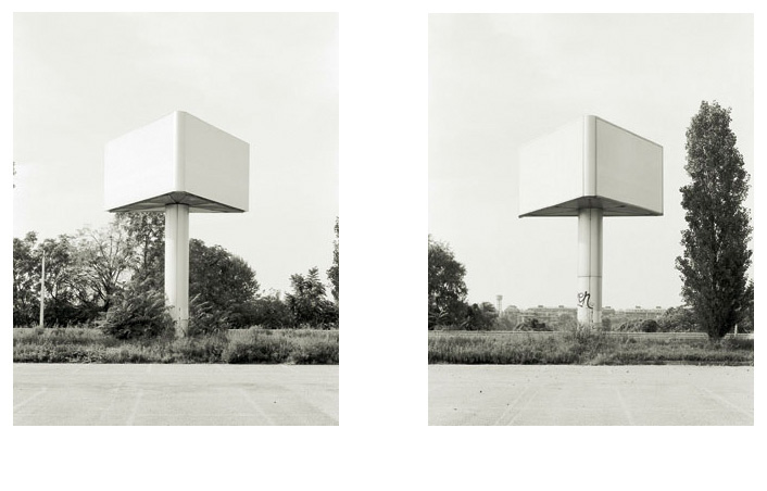
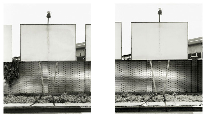
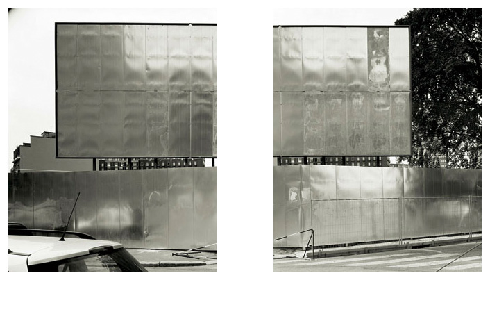
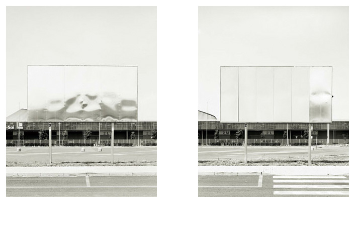
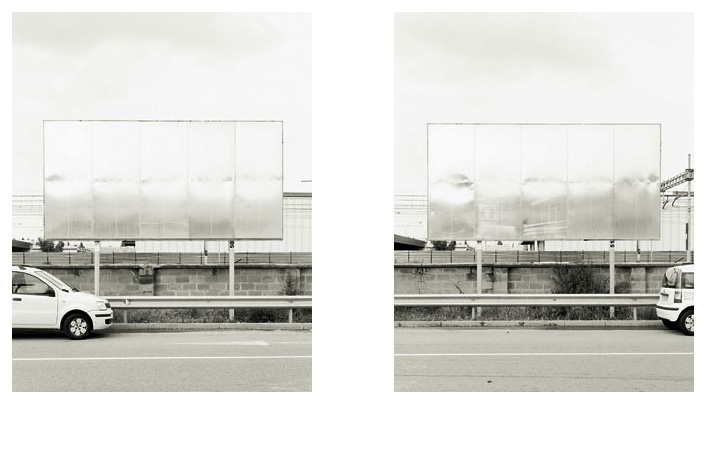
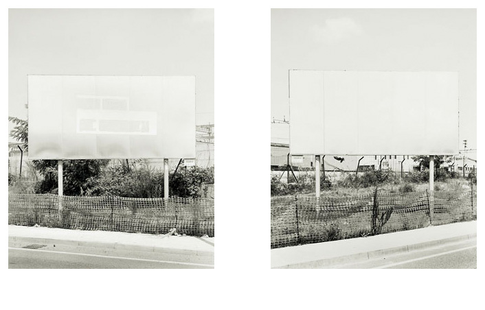
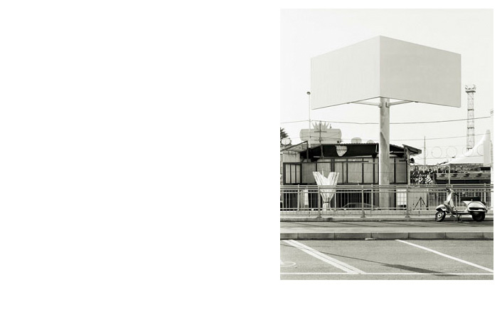
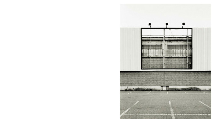
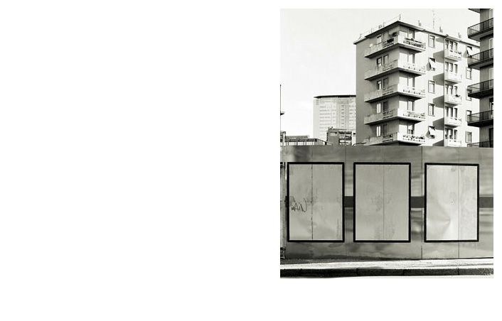
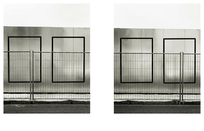
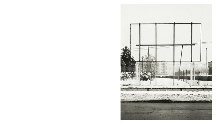
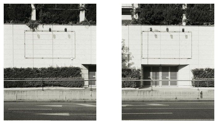
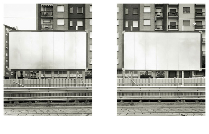
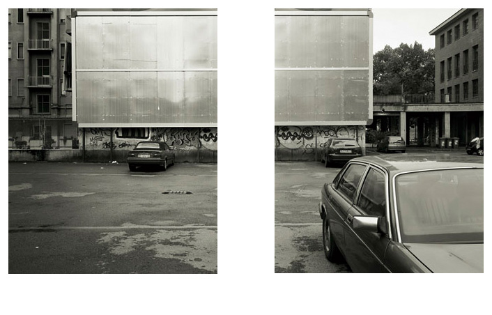
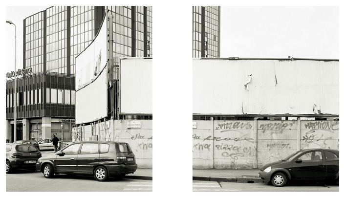
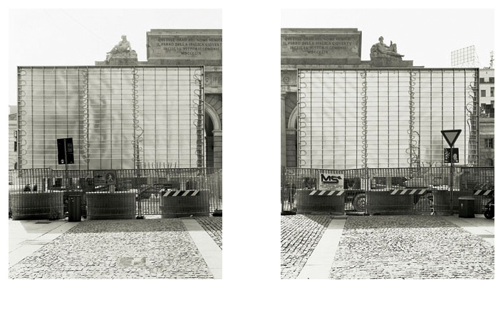
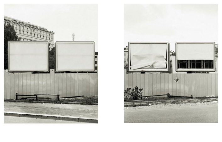
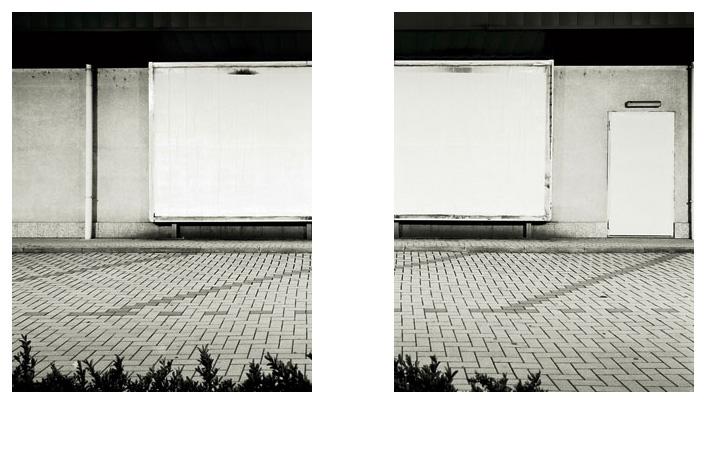
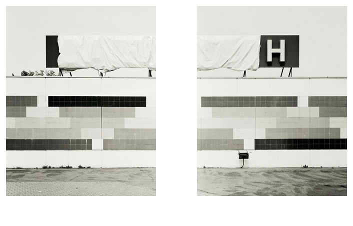
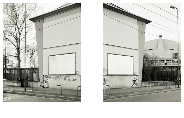
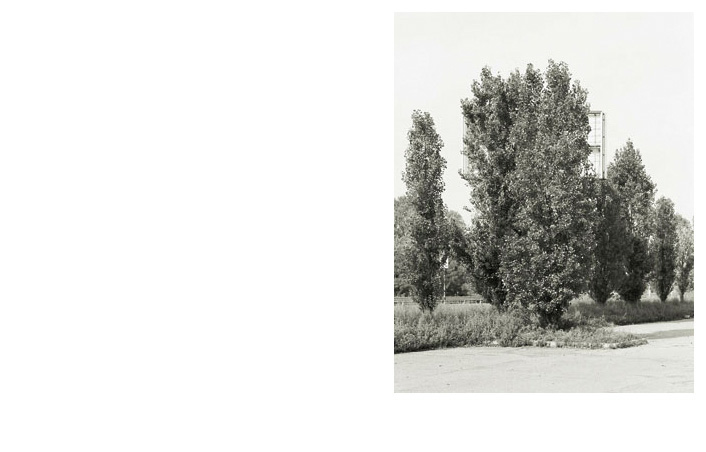
In creating their images photographers often use what is contained within the frame to suggest what has been left out. The detail of a wheel is sufficient to establish the presence of a car, a hand denotes a man and a pile of cannon balls or a ball of fur left hanging from the carcass of a coyote can betoken a scene of death and destruction. Thomas Demand takes this obviousness to its extreme consequences, removing the original subject from his work entirely in order to replace it with a reconstruction of it1. Maurizio Montagna does the opposite with his series of Billboards manifesting a lack, that of the content of the billboards, in order to focus on what is present in his photographs, dominated by vast monochrome surfaces and geometrical structures. His choice of field is plain: Montagna rejects any hypothesis of subjectivity (the space left free of advertising messages does not work as a neutral screen on which individual fantasies can be projected) or idealism, favouring an eminently analytical/declarative orientation for his work.
Montagna is interested in what he can see and what interests him is included in the field of the shot (his images are centripetal, which means they tend not to expand beyond the four sides which bound them). There are, first of all, some similarities with the work of the New Topographers, and the poetics and aesthetic of Ed Ruscha who was a necessary predecessor of that temporary group of photographers, who survived for the duration of an exhibition and yet were able to define a precise trend. Like them Montagna chooses a specific category of subjects within the sphere of a fringe landscape using a terse, stark and concise form of expression, the difference being that by doing so he does not aim at curtailing his uniqueness but, on the contrary, strongly emphasising an entirely personal “style”. Without naivety (and in a genuinely provocative manner) Lewis Baltz stated in the Rochester exhibition catalogue that «The ideal photographic document would appear to be without author or art» 2. On the contrary Montagna is deep within in his work, and demonstrates it more than ever by violating the very rules he pretends to establish, that is to say leaving off a fake Becherian serialness in order to approach or distance himself from his subject, or to observe it from a different angle, no longer frontally, but from the point of view he feels to be the most “conclusive” in an effort to represent it.
This triggers some fundamental observations. First and foremost, the prospect of assigning this project a classifying role can be excluded. It lacks the most basic requirement of science, that is that the operation might be replicated given a series of rules of composition (in photo booths, an instrument designed to enable comparisons, the tracing of a silhouette guarantees that each individual is placed unfailingly in the same position). Montagna does not draw up any classification and neither does he identify typologies. The collection he has put together regards the images themselves and not the objects they contain.
Every single shot in this series derives from the photographer’s faith in the possibility of describing (or reconstructing) a certain measure of beauty through his medium. This attitude is not anachronistic and there is no discontinuity or conflict with the anti-classical or pro-topographical aesthetic through which it is stated. It is a good opportunity for clearing up an oft reiterated yet essentially baseless misunderstanding. There is in fact no contradiction between the rigour of artists who have attributed their work with an eminently “scientific” character, and a steady striving after beauty. In the case of precursor August Sander this is seen largely in the subjects he portrays, protagonists of his ambitious project of cataloguing the human race (with regard to this John Szarkowski writes: «His concept is almost a caricature of teutonic methodology, and if it had been executed by a lesser artist the result might well have been another dreary typological catalogue […] His pictures show us two truths simultaneously and in delicate tension: the social abstraction of occupation and the individual soul who serves it» 3). The same applies to Karl Blossfeldt and the Bechers who, in a series of black and white “atlases”, reveal the order and harmony of the botanical universe (the former) and so-called industrial archaeology (the latter). Finally, Robert Adams’s biography confirms this contradictoriness as he first takes part as founder 4 in the previously mentioned exhibition of the New Topographers and then entitles one of his collections of essays “Beauty in Photography“5.
As usual Maurizio Montagna draws on one and the other to arrive by his own means at a personal complex definition of beauty, made up of orthogonal lines, geometrical shapes, symmetrical compositions, his fascination with light that comes from his familiarity with American photography, while his interest in repetition and series is owed to the Bechers (their images lack light altogether) and to Minimalism.
Maurizio Montagna’s project also has an explicit political content. There has been a mention of the New Topographers’s exhibition. This had the subtitle, often neglected in quotes and references: Photographs of a Man-altered Landscape. The aim of the artists who took part was thus to represent their own landscape including any signs of exploitation or human penetration, therefore opposing the necessarily false or, to be more accurate, incomplete and biased, idealistic account of uncontaminated nature since the invention of photography. Similarly, Montagna proposes to show some fragments of truth (obviously what is meant by this is that kind of truth which can be transmitted through a two-dimensional black and white picture based on rules of perspective and taken by an individual) regarding the geographical and social territory within which he has acted. The Billboards sequence is, first and foremost, a record of a particular category of architecture/design works and their integration in the urban and extra-urban context. In this sense the fact that the structures examined support either nothing at all or only blank surfaces enables a tougher assessment of how they are redefining the surrounding space and should help to increase (the impression of) the scientific nature of this operation. Simultaneously, or according to a different level of interpretation, we find ourselves dealing with categorical evidence of the pervasiveness of advertising messages, paradoxically announced by an absolute and surreal silence, tantamount to a wish to suspend judgement.
It is therefore not a matter of doing something subversive, of removing and wiping out hordes of advertising messages, or of creating a utopia on paper which, on the other hand, actually happened when , from the 1st of January 2007, the liberal mayor of São Paulo ordered the billboards to be taken down from the buildings and streets of his city with the hyperbolic aim of “fighting visual pollution” 6. On his part Montagna does not provide any answers, taking refuge in the ambiguity of his medium. Are advertising billboards good or evil? This is not what interests us. The fact is that they exist and their mere presence determines a series of consequences for the individuals who meet them, modifying their behaviour, as well as repercussions on the space they occupy.
Montagna’s project is not just anti- metaphysical (the billboards are secularised totems buried in the ground) but also anti-narrative. No photograph refers to an event and there is no development or consequentiality between the various shots. Often there isn’t even a series of planes that might create a relationship between the parts which are juxtaposed. They are flat, hieroglyphic images. In this sense Montagna’s series denotes a fundamental distance from that of the last twenty years of Hiroshi Sugimoto’s celebrated cinema which it clearly recalls at first glance. The Japanese artist photographed the screens of large cinemas and drive-ins making the length of the pose coincide with the length of the film which was simultaneously projected. The result is white rectangles of light which illuminate the surrounding space, containing whole stories and all the pictures required in their telling. On the contrary, Montagna’s shots do not imply a “beyond” (Sugimoto’s work has a profoundly religious sense) or any nostalgia. Each one contains sufficient richness and clarity to satisfy the collective need to relate to the world through a photographic reproduction of it.
1 Obviously this only happens when an object/environment is the starting point of the work of the German artist, as in the case of the project entitled Yellowcake, in which the rooms of the embassy of Niger in Rome, scene of a dark episode in international politics, are reproduced in detailed paper models and subsequently photographed again and enlarged.
2 William Jenkins (editor), New Topographics: Photographs of a Man-altered Landscape, International Museum of Photography at George Eastman House, Rochester 1975, page 6. Guest photographers were: Robert Adams, Lewis Baltz, Bernd and Hilla Becher (the only non-Americans), Joe Deal, Frank Gohlke, Nicholas Nixon, John Schott, Stephen Shore, Henry Wessel Jr.
3 John Szarkowski, Looking at Photographs: 100 Pictures from the Collection of the Museum of Modern Art, The Museum of Modern Art, New York 1973, p. 102.
4 It is the same Lewis Baltz who reviewed Robert Adams’ book The New West: Landscapes Along the Colorado Front Range (The Colorado Associated University Press, Boulder 1974) , saying it was a model of new documentary photography. Cf. Lewis Baltz, Review of The New West, in “Art in America”, vol. 63, no. 2, 1975.
5 Robert Adams, Beauty in Photography. Essays in Defense of Traditional Values, Aperture, New York 1981.
Moreover, the same Rochester catalogue (New Topographics…, page 7) contained this remark of Robert Adams in reference to his work: («Pictures should look like they were easily taken. Otherwise beauty in the world is made to seem elusive and rare, which it is not»).
6 See law 14.223 of the Prefecture of São Paulo. Moreover, something similar happened in Spain in 1988 with the decision to remove all roadside advertising, although this was done with the aim of increasing road safety. Even the historical bulls of Grupo Osborne were wiped clean of commercial propaganda but their enormous black silhouettes still dotted the horizon since, in the words of the Tribunal Supremo, “they had outstripped their original advertising purpose to become part of the landscape”.
Text and notes by Francesco Zanot

